

.svg)


.svg)
.svg)
.svg)
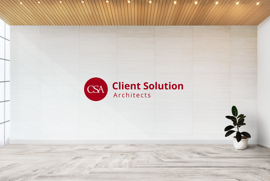
CSA’s new brand identity
May 1, 2020 – SAN DIEGO. Client Solution Architects (CSA) released its updated logo and is going back to where it all started: with its full name, Client Solution Architects. Additionally, the company shed its Guidance Consulting tagline and went for a simplistic signature approach. “The name Client Solution Architects has been behind hundreds of millions of dollars of contract wins over its 17-year history,” said Emilie Vicchio, CSA’s director of marketing and brand management. “Our name helped secure supply chains, acquire multimillion-dollar weapon systems and reinvigorate dated program offices. We wanted to shed all the fluff and get back to our roots, and today’s logo aligns perfectly with our mission and with the road ahead.” The updated name isn’t the only thing that changed. CSA also changed its signature color, crimson red, to a more vibrant and fast-paced red, which the company calls innovation red. The one unchanged element is the wordmark CSA, which holds most of CSA’s brand value. CSA will roll out additional brand color changes in the coming months to things like CSA’s website, brochures and social media accounts. To see and download CSA’s new logo, visit the company’s brand guidelines»


